Truth behind Starbucks’ meaning was revealed after 53 years
Do you know the exact meaning of Starbucks?
The revelation of Starbucks’ true meaning after 53 years has left people astounded.
Founded in 1971 by Jerry Baldwin, Zev Siegl, and Gordon Bowker, Starbucks has grown to become the largest coffeehouse chain worldwide.
The truth behind Starbucks’ meaning was revealed after 53 years
The iconic name of Starbucks was derived from a brainstorming session involving artist Terry Heckler, who collaborated with the founders to establish the brand.
The company wanted a name that would evoke a sense of adventure, connect to the Northwest region, and pay homage to the seafaring tradition of early coffee traders.
Initially, co-founder Gordon Bowker proposed the name “Pequod,” inspired by the ship in Herman Melville’s classic novel “Moby-Dick.” However, Terry objected, saying, “Would a cup o’ Pee-kwod appeal to anyone?”
During their research on mining camps near Mt. Rainier, Terry stumbled upon the name “Starbo.” This finding brought them back to their initial point.
Terry remembered the first mate on the Pequod in “Moby-Dick” named Starbuck, which sparked inspiration for the brand name.
The first Starbucks store was situated in Seattle’s Pike Place Market and was quite small, only measuring 1,000 square feet and it operated with just one employee.
Despite its humble size, the store had an impressive selection of more than 30 types of whole-bean coffee.
To garner the attention of customers, it proudly displayed its iconic Siren logo
Remarkably, even after 53 years, the store remains open and continues to attract large crowds of tourists who eagerly wait in long lines to visit this historic location.
Previously, people were left in awe after learning about the truth behind 7-Eleven’s logo which had gone unnoticed for years.
A social media user with the username @twosometravellers brought attention to a small yet important element in the 7-Eleven logo.
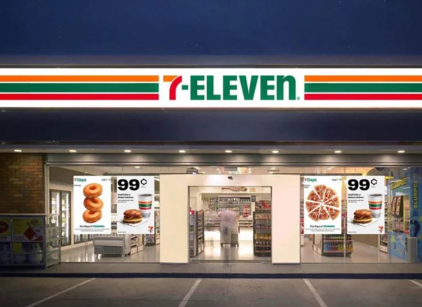
In a viral video posted on Instagram, they revealed that most of the letters in the “7-ELEVEN” sign are uppercase, except for the last letter ‘n,’ which is lowercase. This surprised them, and they wondered if it had always been that way.
Remarkably, it was discovered that the lowercase ‘n’ in the 7-Eleven logo was intentionally chosen by the original owner’s wife.
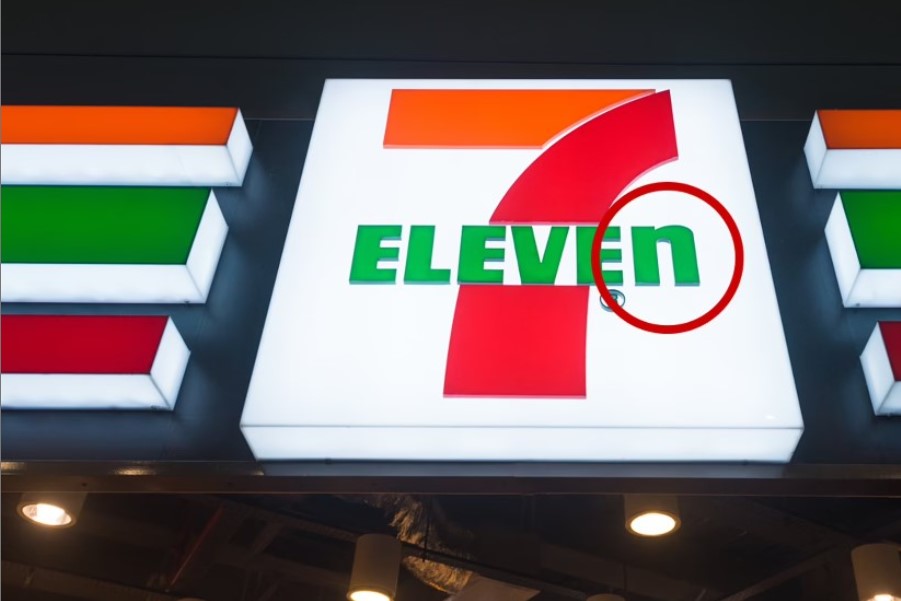
She thought it would bring a sense of elegance to the logo, creating a contrast with the bold uppercase letters. Surprisingly, this detail has stayed the same since 1968, surprising those who had never noticed it before.